
Avo
Tools Used
Figma
FigJam
Adobe Illustrator
Role
UI & UX Design
Visual Design
Team
Rumi Sait
Nidhi Malpani
Date
Spring 2023
Sections
Problem
30-40% of all food produced is wasted and 18-24 year olds, including college students, are the largest demographic of food waste contributors.
How might we track the shelf life of household foods for college students in order to minimize food waste?
Solution Preview

Avo minimizes college food waste by tracking household items and expiration dates with ease.
User Interview
We conducted a user interview in a question and observation format. We first asked our pre-developed questions and then followed our interviewee along on their shopping trip, from leaving the house to making it back and unloading groceries.
Key Findings
Records shopping lists on notes app to remember without writing down
Buys more frozen items for ease of use
Tends to overspend at convenience stores to buy forgotten items
Preference towards purchasing items with longer shelf lives
Opportunities
The ability to track when items will perish provides greater flexibility in ingredient purchases
Providing recipe ideas will reduce the need to buy excess at convenience stores
Providing a history of scanned receipts can help the user recall previously purchased items
Interview Questions

Archetypes
Following comprehensive user interviews, we developed an affinity map to reveal distinct archetypes. These archetypes played a pivotal role in shaping our user-centered design strategy.

Looking at the scales of Underbuying and Overbuying intersected with Living Situations, we revealed 4 Archetypes:
The Convenience Minimalist, someone who lives alone and doesn't buy enough.
The Single Surplus Shopper who overbuys and live alone.
The Unsynced Co-Shopper who lives with a roommate but doesn't buy enough.
Generous Co-Shopper that lives with a roommate/roommates, but buys too much.
User Flow
Building a user flow helped us find where we wanted to focus our attention on, what screens to develop, and how a user would fully interact with the solution.

We developed sections of flows, like a tour of the app, the overall pantry section, and divided how items are added by Scanning Receipt, Scanning Item, and Custom entry. Focusing on these forms of data entry was important to us as it was a weakness we found during our competitive analysis.
Competitive Analysis
On the App Store — Cooklist, Fridgely
Doing a full app walkthrough of both Cooklist and Fridgely revealed key strengths and weaknesses in their interfaces and experience.
Cooklist
Store account connection
Onboarding
Food waste prompts
Receipt scanning preview screen
Overwhelming amount of options
Hard to navigate after first time use
No instant access to on the go features
Looking at Cooklist's receipt scanning feature helped us with a baseline on how to and how not to build our receipt scanning features.
Core Function
Cooklist generates a grocery shopping list with only the ingredients that you are missing in your pantry and need to buy. It’s a meal kit experience at grocery store prices.
Fridgely
Simplified layout
Receipt scanning interface
Shopping List Conversion
No CTA on blank state
Onboarding lacks app overview
Unbalanced layout for adding item creates confusion
Manual item entry is unintuitive due to order
Looking at Fridgely's main dashboard and ideating on improvements helped us build a usable dashboard in our final product.
Core Function
Manages pantry items and their key information through receipts and barcode scanning, providing alerts for when items are about to expire.
Wireframes
We picked 8 screens to focus our attention on from our User Flow, starting with a sketch and digitizing it into a low fidelity wireframe.
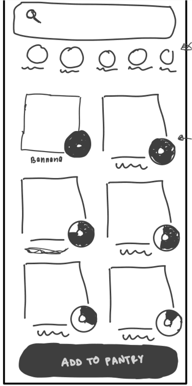
Item preview
Expiration Indicator
Food Category Filter
Search
Dashboard Screen
Overview
The Dashboard Screen provides the user an overview of most urgent pantry items, allowing the ability to search and filter by most popular categories and quickly add items to their pantry.
Connection to Archetype
This appeals to the Generous Co-Shopper and the Single Surplus Co-Shopper as it helps with managing the already available ingredients
Connection to Competitive Analysis
The dashboard page we've designed is based on our competitive analysis, which revealed that Fridgely lacked this feature.
Product Image
Title
Expiration date
Quantity
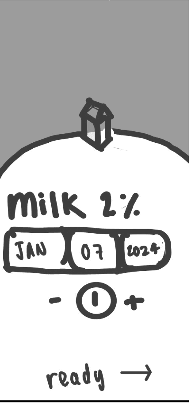
Item Preview
Overview
The Item Preview screen provides the user with a visually appealing overview of the product they just scanned, emphasizing the ability to adjust the expiration date.
Connection to Archetype
This appeals to the Convenience Minimalist as it gives them an understanding on how long their products will last on first glance.
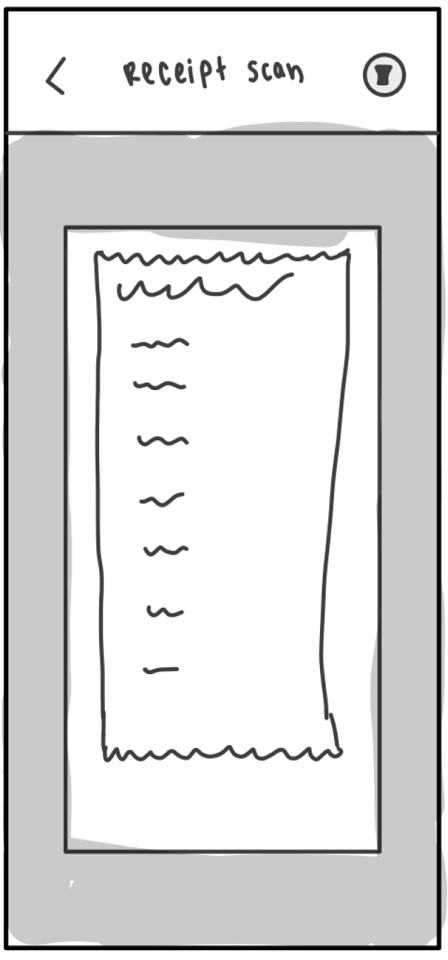
Shutter
Flashlight
Receipt Photo Scan
Overview
One of the two convenient options of adding items is the receipt scan function, allowing rapid addition. One problem we encountered here was the task of adding expiration dates to each item and longer receipts.
Connection to Archetype
This appeals to both the Unsynced and Generous Co-shoppers as with roommates they will have more items to import.
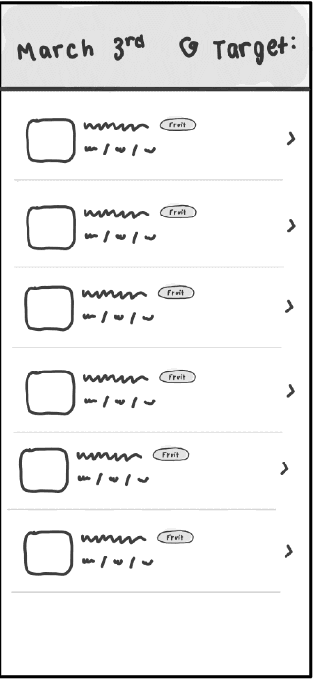
Product Card
image
Product name
Expiration
Status
Store Overview
Overview After Scan
Overview
This screen addresses the issue with we encountered with the original receipt scanning function, simplifying the task of managing multiple expiration dates by enabling quick review and edits.
Connection to Archetype
This appeals to the Surplus Shopper archetypes to give them a true overview of how many items they purchased.
Iterations
Dashboard
The layout of Home Dashboard was a crucial task, as that was one of the main takeaways from our competitive analysis. We needed an easy way for users to determine the name and state of their food items. We tried forms of list, carousel, and grid views, ultimately choosing a grid view with a status indicator for each item.
A

Option A separates pantry items and refrigerated items, showing the pantry items in a list view. We found that starting on this screen didn’t provide users with any benefit.
B

Option B uses the same bones as Option A and also separates pantry items and refrigerated items, but shows all in icon format. While this layout provides more benefit, it isn’t able to feature enough items.
C

Option C shows all items together, but provides easy icon filters to pare down results. This option also sorts items based on expiration date, so expiring items show up first.
Navigation Bar
Originally, we didn’t think we needed a navigation bar, but after putting wireframes together and looking at flows, we saw the need to include a navigation bar, even if it only includes 3 options.
A

Option A provides a wide area to select the Scan function, with the Home and Receipt icons being pushed to the left and right side.
B
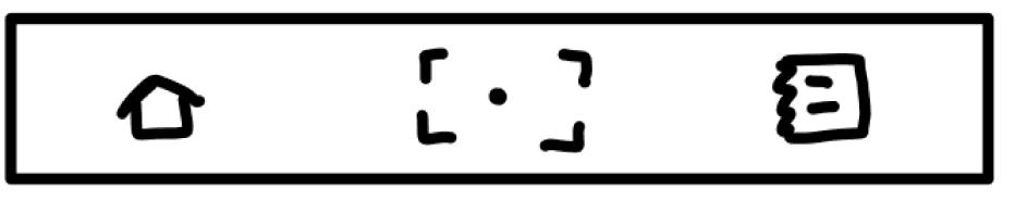
Option B also provides a wide space, but uses scale to show emphasis on the scan icon, rather than the width the icon takes up.
C
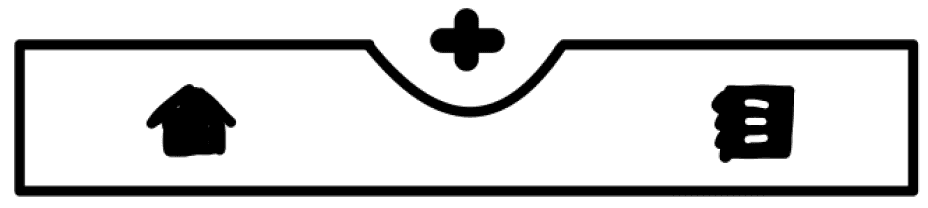
Option C uses negative space for emphasis, along with scale, also using the “+” for simplification and easy readability.
D
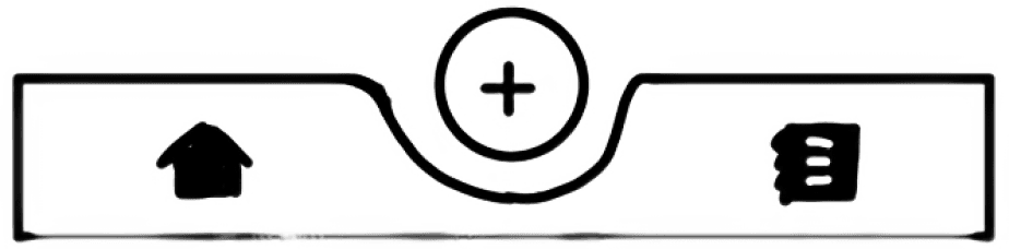
Option D uses negative space for emphasis, but adds a background highlighting the center more, allowing the Home and Receipt icons to be balanced.
Final Solution
Expiration Status Tags
We ultimately decided on using sticker-like tags to indicate food status. This allows for quick glances to determine the status of foods. We found that showing exact progress was too specific and unnecessary for our user's goals.

Good
Shows when item has plenty of life.
Indicates to user that this item is good to use.
Going
Shows when item is approaching expiration date.
Indicates to user to utilize this ingredient first.
Gone
Shows when item is expired.
Indicates to user to discard the item
Item Card on Review Screen
The Item card on the review screen shown after scanning a receipt shows the category of item along with the expiration date and a large photo box to confirm the item is correct. This allows the user to look through and only make changes to specific items that need to be changed.


Food Category
Allows for quick Mental Sorting
Iconography

Final Solution - by Action
See Current Grocery Items
Visual Hierarchy
The main dashboard is your go-to spot for an instant view of your stocked items. Colored tags offer a quick visual cue, guiding you on what needs attention – simplifying your decision-making.
Accessibility
In addition to colors, we've integrated icons to make the system accessible for those with color vision deficiencies.
Get More Information on a Specific Item
Adjust Item Details
Clicking into items allows the user adjust the expiration date, move the item into the freezer, extending its life, and see key tips specific to the item selected.
Search for a Particular Item
Filter Further
The user can narrow down farther using the search function. Opening search also reveals a way to filter by Good, Going, and Gone.
Add Items
Quickly Add
A colored plus button allows quick on the go access to the add item screen. This is by design, as we found that this function will mostly be used on the go, so having easy access is crucial.
Scan Receipt
Long Receipts
Adding by a receipt allows for multiple scans as receipts will not always fit in the camera’s view.
Scan Barcode
Scanning per item allows for quick entry of the quantity of the item and the expiration.
Seamless Adjusting
The format of entry for the expiration date follows the style that expiration dates are written, making entry extremely low effort.
In Context

After getting home from the grocery store, as you are unloading your items, you open the Avo app and select the Plus button to start scanning your items.

While at the grocery store, you receive a notification from Avo letting you know one of the items you have in your fridge is about to expire.
Key Takeaways
I narrowed my reflection down to 4 key points, covering collaboration, testing, and revision.
1
Go Back to the Drawing Board
Throughout the process, we found ourselves making realizations and taking a step back to modify. This caused us to go back to the wireframing stage multiple times, for adding a navigation bar or solving an experience problem.
2
Ask for Help
My team member and I had grand ideas for illustrations for our final branding but realized we did not have the skill set to achieve the best graphics possible. This caused us to reach out for help from friends to create graphics we were proud of. This taught me to be open with my design process and ask for help when I need it.
3
Journey Map, Journey Map, Journey Map
Due to the short timeline of this project, we were not able to conduct as many user interviews as we liked. This also meant we were not able to take multiple users through the journey and record their feelings and pain points in the process. I believe that this would have helped us later on in the process as we encountered these pain points very late in the process.
4
User Test and Make it Best
Another element that I wish we could have done was user testing on the final product. Because we made a full prototype, we had the opportunity to conduct user testing, but because of the short timeline, this was not possible. I hope to come back to this project and conduct User Testing and improve on the result.

